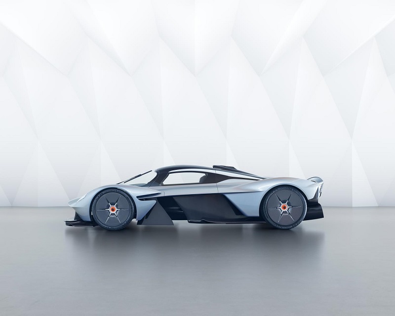
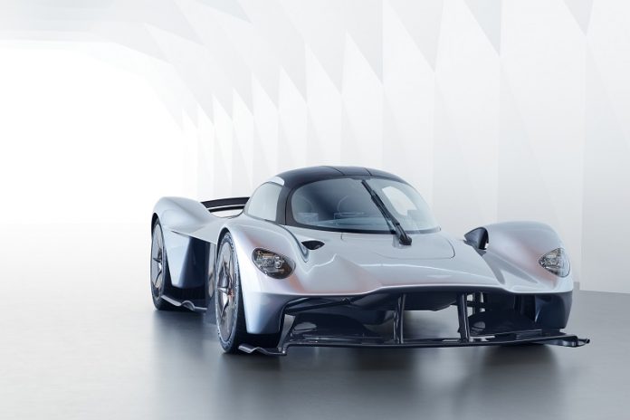
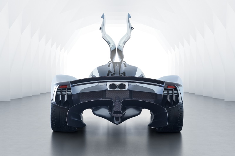
Aston Martin has released some more details – and pictures for that matter – of its design for the new Valkyrie hypercar. Now I’m not afraid to admit, when I first saw this car in pictures I didn’t think much of it, but once I saw it in the metal I was blown away. You really need to see it in real life to truly appreciate the sculpted curves of this futuristic racer.
Not Just A Pretty Face
It’s not all about form though, there is plenty of function too. For example, take that teardrop-shaped cabin, not only does it look sleek, but it’s super aerodynamic as well. The inside is minimal and driver focused, but it’s also practical (ish) as well. The slim seats have been mounted directly to the tub to give more space inside, and both occupants will adopt a ‘feet up’ position, mirroring the seating position of a racing car.
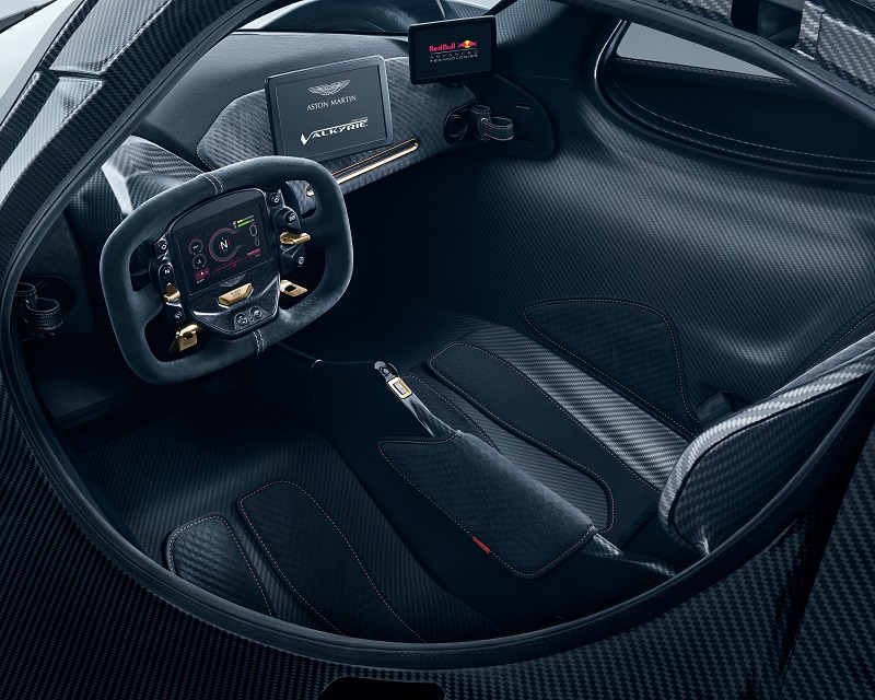
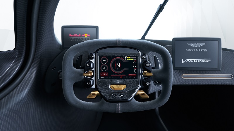
Like any racing car, the detachable steering wheel is festooned with many buttons, meaning the driver will never need to fumble about with buttons on the dashboard. The information fed to the driver is displayed on a OLED screen, which once again is driver focused. There is also a small display at the base of the A-Pillars which take the place of conventional door mirrors. There is also no rear view mirror as the roof mounted air intake means there is no rear window.
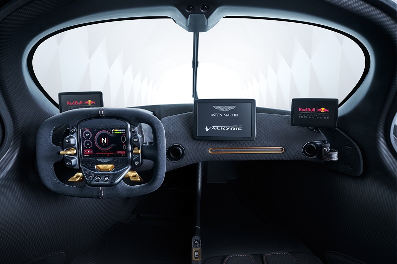
Matt Hill, Aston Martin Creative Director of Interiors said of the Aston Martin Valkyrie’s cockpit design: “It’s been a tremendous challenge to make the interior packaging work. We’ve embraced Red Bull Racing’s Formula One ethos and approached from a different angle than conventional road car design. In this instance, we’ve started from a position where you think something is impossible and work at it until you find a way to make it work.
“We’ve been fighting for millimetres everywhere, but the battle has been worth it, as it’s been fantastic seeing customers try the interior buck for size. They love the ritual of getting in and how it feels to be sat behind the wheel. They’re also genuinely surprised at how the car just seems to swallow them. You really do have to sit in it to believe there is genuine space for two large adults.”
Form AND Function
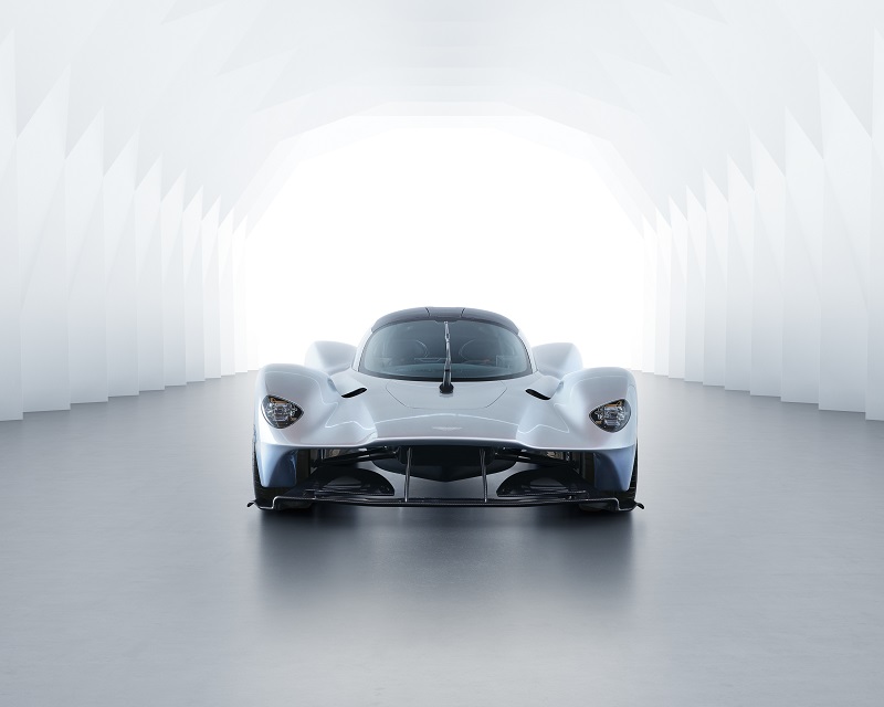
The pictures of the new model are very similar to the original concept, but there have been a few tweaks here and there. For example, the opening surface between the cockpit and front wheel arches have been amended to better downforce and to give the hypercar a sleeker look. The standard Aston Martin badge has been ditched as well as it was deemed too heavy, but fear not, it wasn’t replaced with a sticker like a Porsche. What Aston Martin chose instead was a chemical etched aluminium badge which is 70 microns thick – 30% thinner than a human hair no less.
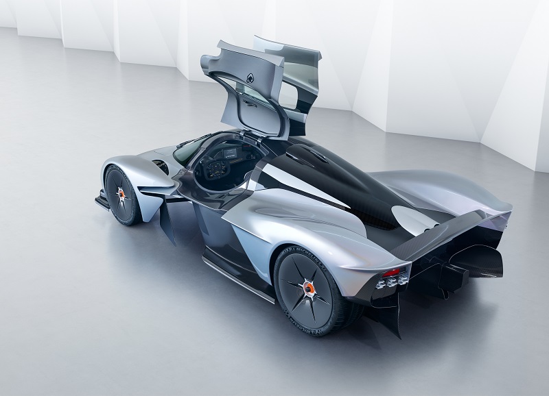
Aston Martin Creative Director of Exterior Design, Miles Nurnberger, said of the Aston martin Valkyrie’s design evolution: “I would say we’re around 95 per cent of the way there with the exterior design. Much of what you see is actually the structure of the car, so this had to be signed-off relatively early in the project. The remaining areas of non-structural bodywork are still subject to evolution and change as Adrian [Newey] continues to explore way of finding more downforce.
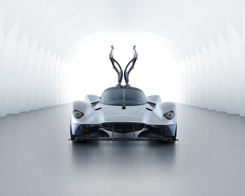
“The new outlets in the body are a case in point. Ordinarily the last thing we’d want to do to one of our surfaces is cut a hole in it, but these vents work the front wings so much harder that they’ve found a significant gain in front downforce. The fact that they are so effective gives them their own functional beauty, but we’ve finessed them without impacting on their functionality. That they also serve as windows through which to view the fabulous wing section front wishbones is a welcome bonus!”
